
U·START
Create Together
My Role
Redesign the project search page and project profile page based on the new design system
Conduct user interview to find the problems and solutions
Ran user testings
Project Type
Redesign the website UI with design team
Duration
10 Weeks

Overview
U•Start is a creation platform where college students can highlight all their skills, portfolio, and past projects in a modern, sleek way that does not require going to multiple different sources.
Users can also share ideas for new projects with others on the U•Start network in hopes of finding people with the necessary skillsets to develop the project. It will also allow students without ideas to browse through projects and contact other users about joining the projects that interest them.
The beauty in U•Start is it is not niche-based; collaboration between individuals from different schools and schools of thought becomes possible, and is encouraged.
Objective
According to the situation of the current website, which is designed and built about 5 years ago, the overall objectives are as follows:
Redesign the UI of the project search page and project profile page to make the website interface conform to modern aesthetics
Adjust the existing functions according to the user's needs to ensure that users can easily find the most suitable project
Keywords

Design Process
Problem Discovery
Because the UI design of U·START has not been iterated since it was launched five years ago, there are many deficiencies in both operation experience and visual language. So the first task for me is to collect user needs and feedback and identify key functions.
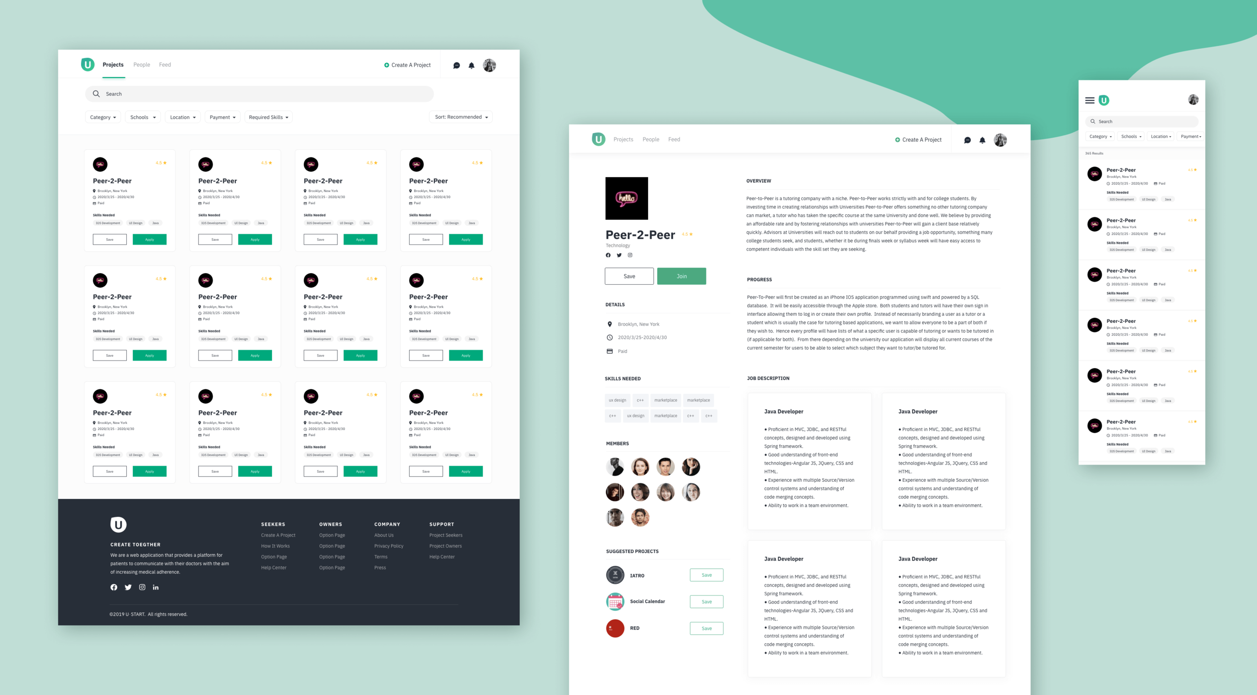
Project Search Page

Project Profile Page

Information Architecture
After the problem is determined, firstly, I use the mind map to sort out the information on the page, then layered the structure and planned the interface layout.


Prototyping
Then I quickly drew the sketch, carried out the general layout design, and produced the low fidelity design drawing to determine the preliminary scheme.
Feedback and Modification
According to the suggestions put forward by the design group and the modification suggestions from users, the prototype is modified to make it more in line with the aesthetic and requirements.
Project Profile Page
Remove the banner in the primary layout
Add “Save“ buttons on the similar project tabs
Project Search Page
Changed the 5-column layout to the 4-column layout, which increases the readability and legibility
Outlined the “Save“ button to separate it from the tags
Styling Guide
According to the latest VI design, the main color of green is retained, and the auxiliary color of black, white, and gray is used to create a clean and refreshing interface style, which conforms to the overall positioning of the product and fits the user's psychological perception.


