SparkBox
Keep the sparks alive

Tools
Figma, Principle
Duration
14 Weeks
My Role
User Research
UI Design
Motion Design
Overview
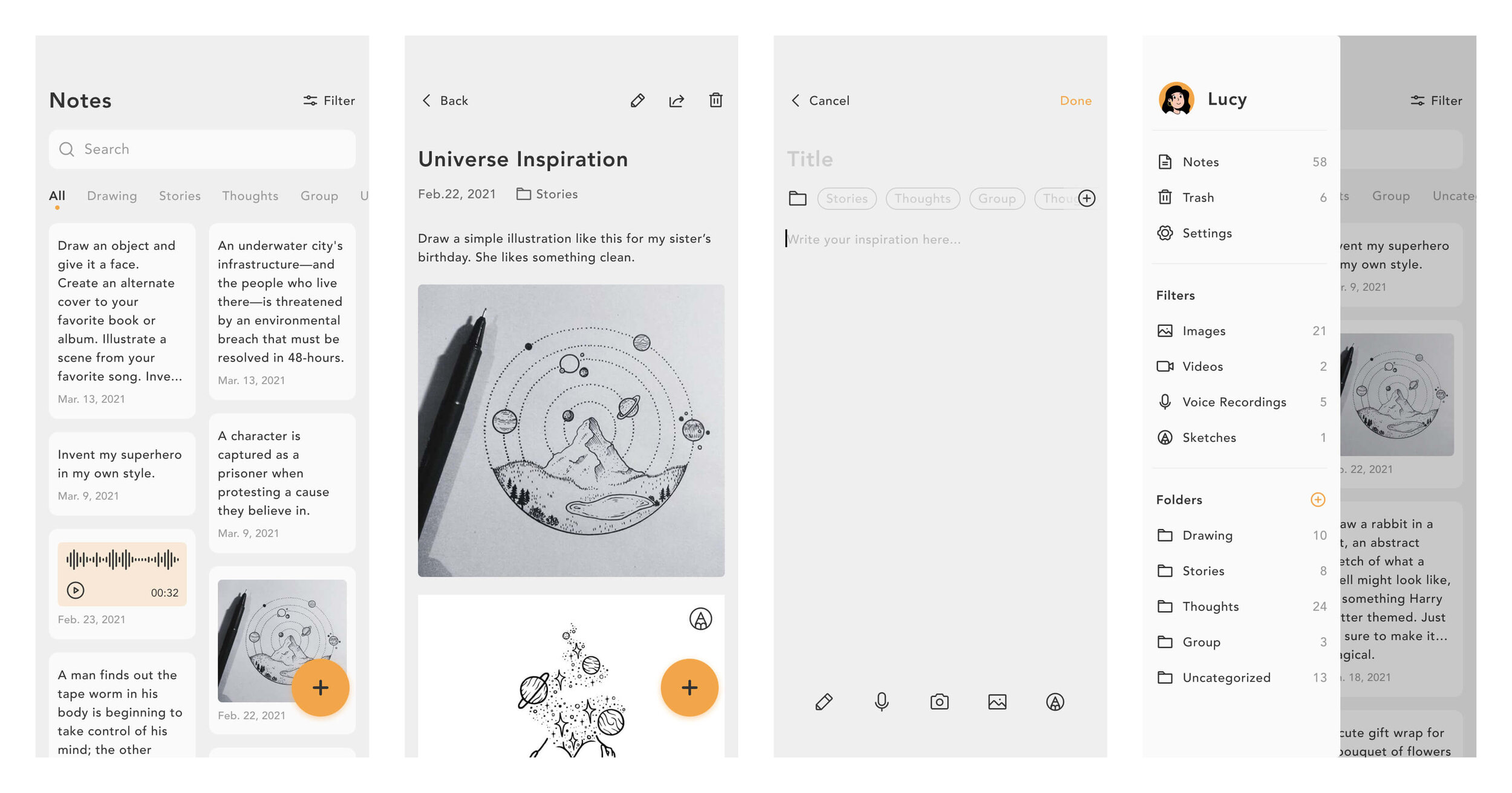
SparkBox is an app that helps users record their inspirations by note-taking, allowing them to write, photograph, record, or draw their fleeting inspirations and categorize them in folders. To find a specific note, users can look through folders, use filters, or search for keywords directly. I made this app because I wanted to have a tool to help me keep tracking inspirations when I was looking for a senior project idea. Therefore I designed this app, and I hope to bring it to all creative workers and
keep their sparks alive.
Understand Needs
Competitive Analysis
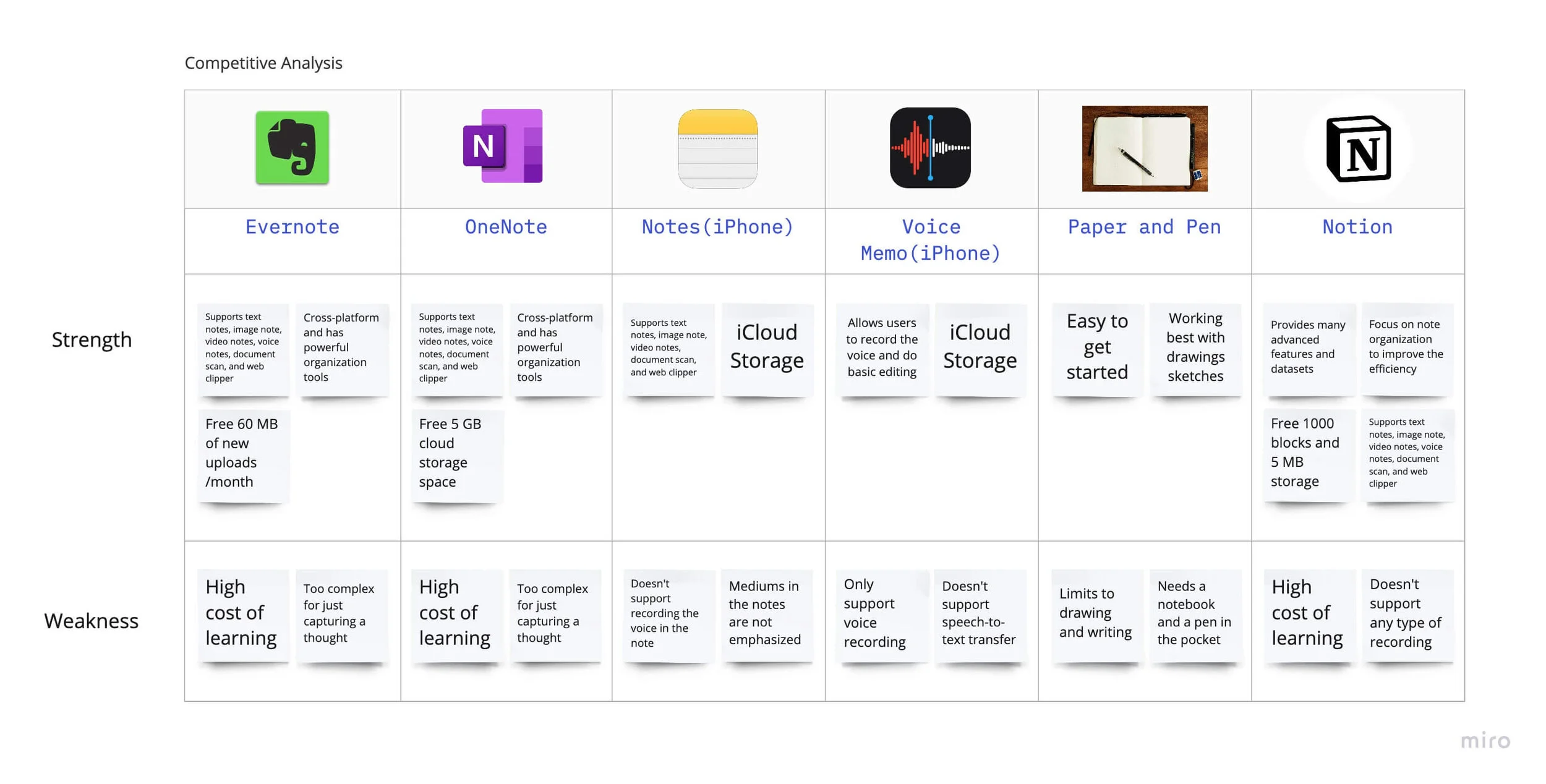
To better understand the market, I listed the strengths and weaknesses of the six competitors and made a SWOT-style chart to demonstrate the differences between these apps, and their strengths and weaknesses.
I found that note-taking software like Notion, Evernote, and OneNote support many kinds of media and integrate many functions to achieve the effect of "all in one." However, their learning costs are generally higher, and they pay more attention to information collation and document editing.
Apps like Memos and Voice Memos are very lightweight and suitable for recording a piece of the idea. However, they are often not well integrated with the many media.
Based on competitive analysis, I decided to create a lightweight app that supports multiple media and can help users build their inspiration library, record, and view their thoughts at any time.
User Interviews
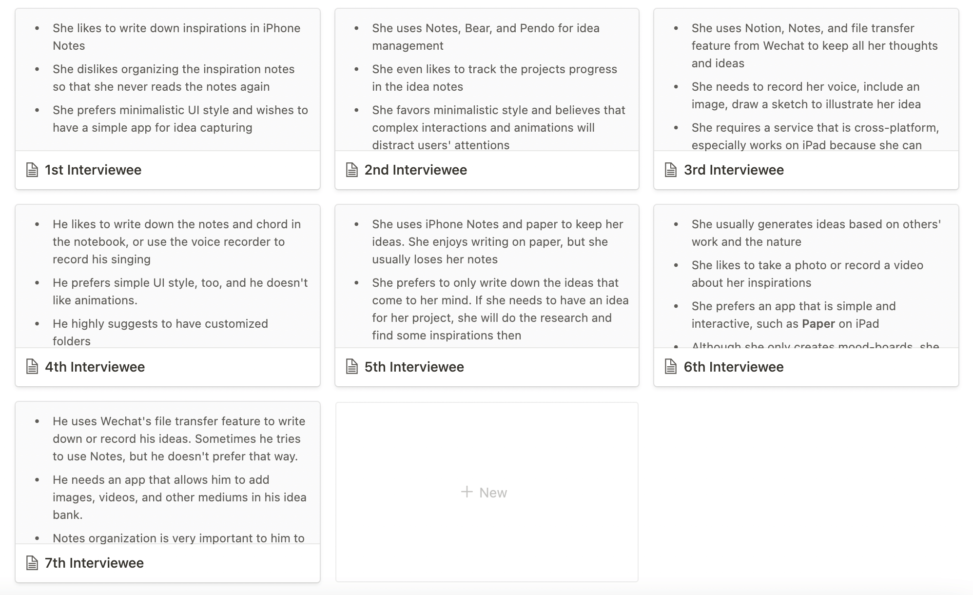
I have interviewed seven people who work in the creative industry or major in arts. They have various interests and concentrations. I wrote down the essential details about their experience, their preference for the app, and suggestions in Notion.
According to the user interview results, my target users preferred the minimalist UI, simple interaction, intuitive interface, and required a developed note classification system and search function.
Here is my user personas based on my user interview results.
Design Process
Site Map
At the beginning of the design process, I made a site map to act as an app structural reference. There were mainly two parts: adding notes and managing notes.
Sketch & Wireframes
To explore the interaction flow and screen layouts, I first sketched out some ideas. Then, based on the site map, I illustrate my early ideas in Figma.
Why are there two layouts of my home page?
In the early stage, I had many ideas on the layout of the home page and came up with many possibilities. But after discussing with other designers and product managers, I gave up the "fold and unfold" layout in wireframes because they would make the page length increase significantly. Finally, I chose the double-column flow display, shown in my sketch, to save more space.
Styling Guide
To find the inspiration for the primary color for SparkBox, I communicate with many friends and designers and ask them to write down the colors they can think of when it comes to inspiration, sparks, thoughts, and ideas. In the end, between soft blue and vivid yellow, I chose yellow to represent SparkBox users' active minds, creativities, and various inspirations.
Final Design
Interactions, dark mode, and motion demo
Light Mode
Dark Mode
Reflections
When we encounter bottlenecks, we can get helpful feedback by talking with other professional designers or product managers. For example, they will recommend some products for reference and give you many insights.
Project planning is beneficial. According to the schedule set initially, we can complete all tasks on time, but it is also necessary to temporarily adjust the plan according to emergencies.
How to differentiate our products from other existing products is an essential and challenging task, which requires a lot of thinking and research.


